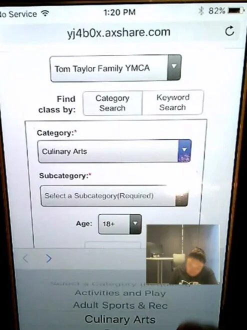
YMCA Class Registration
Client
YMCA of Pierce and Kitsap County
Role
Lead UX Designer / Co-Researcher
Project Overview
The local branches of the YMCA were receiving complaints with their online class registration system, resulting in disgruntled parents flooding the lobbies on registration day to sign their kids up.
Team goal: To ease the registration process through a mobile first approach that also mitigates the stress of the Y employees and members alike.
Foundational research
To help get a better idea of the true problem I worked closely with the UX researcher to aid in the research as well as help run the workshops.
Methods
Goal setting workshop with stakeholders
Onsite observation
Staff interviews
Initial surveys
Baseline testing
Designing a solution
Through our foundational research, we saw three key opportunities to enhance the experience:
1. Have a mobile first approach
While this is a good principle for all projects, we found it was especially critical for this project. Parents frequently found themselves needing to sign their kids up while at work when registration opened, oftentimes performing this on their phone. Classes fill up fast, and parents often need to register as soon as possible in order to ensure they get a spot.
2. Start with picking a branch
Branch selection is critical to making the remainder of the experience successful. We found during research that parents would often sign their kids up for the wrong branch due to focusing too much on the time and not the location.
3. Consistency where possible
Create a consistent category and subcategory list across branches to prevent confusion and discrepancy, as well as make it easier to feed in the information from the third party system that stores the data.
Testing, Iterating, and Presenting our Findings
Card sorting workshop
We gathered stakeholders across several Ys and facilitated a card sort to help them align on a consistent category/subcategory structure.
Prototyping and user testing
I used Axure to create a full functioning prototype for the purposes of communication to the client and evaluation. We ran a moderated on-site test with real Y members on both mobile and desktop, iterating as we tested.
Delivery
After incorporating all of our findings into the prototype, we presented the final wireframes with the client before passing it off to the graphic designer and developer.
Final Wireframes


A page from the desktop experience.
Aftermath
After we released the new registration system, survey results came back considerably better than before.
On a scale from 1-7 on how satisfied the user is with the registration system, the average score moved from 4.0 to 5.42.
In a subsequent usability test we saw our success rate go from 60% in baseline to 91% in our summative assessment.


